Hey blog, I'm back! & NYFW inspiration
Well…. it’s been over a year since my last post! Yikes!
I love writing blog posts, but truth be told… about 99% of the time I prioritize other aspects of my business. I’m going to set a goal to write at least once a month. It’s an aspect of my business that I enjoy & feel like I’m contributing something a bit more permanent to the world. Recently I shared some New York Fashion Week Inspiration in my stories, but here I wanted to focus on the two main trends I’ve been drawn to and how they inform my art.
*All images were sourced from this Elle article and photographed by Tyler Joe
MONOCHROMATIC / TONE ON TONE
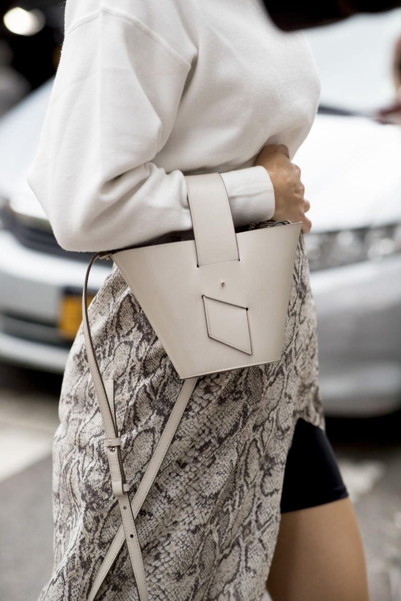
So much of my work as of late has been monochromatic, or tone on tone. Similarly to these outfits, the interest in my work comes more from the texture & brush strokes than the variation of color. It’s calming to me & allows the eye to rest a bit more. The third image below is a great example — your eye is drawn to the amazing structure & detail in the skirt. Imagine if her skirt was pink, the belt was plaid, & the top was white. Each variation would be competing for your attention. When it’s all in one calming hue your eye is allowed to rest & pay a bit more attention to the detail & structure of the garment.
I have a fairly minimalistic, or “well curated” style and I think my work fits so well in a home that doesn’t have a lot competing for it’s attention. I like to think of my work as a little oasis where you can pause and let your eye float over the variations of texture & movement.
SHADES OF CINNAMON & CAMEL
I adore this color & all it’s variations! It’s warm, inviting, and reminds me of comforting things like caramel lattes ;) It’s incredibly classic & timeless as well — think the trench coat — it’s never gone out of style!
I’ve been enjoying introducing this shade in to my work a bit more & hope to make a monochromatic warm cinnamon painting soon :)
Where do you find your inspiration?!
xo, Mel


